Sunday, June 5, 2016

Meizu MX4 Pro

Meizu MX4 Pro review:

Meizu MX4 Pro


Introduction

What should the ideal smartphone look like?

Most of you will point out that a large and vivid display, powerful processor, a solid, refined design, and a good camera are a must. Good battery life is also essential, and so is a fast and good-looking user interface. The more demanding will point to fingerprint security as a requirement, and sound aficionados will hope for crystal clarity in music playback. Why are we listing all those wishes now and here? Simple: on paper, the Meizu MX4 Pro has got it all.

Yet another high-profile handset from China, the MX4 Pro is a creation of the company Meizu, which has its root in the music industry. It’s thus no surprise that - apart from having all the basics covered - one of the key selling points of MX4 Pro is its ‘hi-fi’ audio. It also packs a fingerprint reader, but those are hardly its only highlights: it delivers with a 5.5” Quad HD, nearly bezel-less display, a powerful, octa-core Exynos 5430 system chip, a 20-megapixel main camera and a spacious 3350mAh battery.

All of that at a price lower than that of a flagship from a first-tier company like Samsung and Apple. Is it all as good in reality as it looks on paper, though? Let’s find out!

In the box:

  • 2A wall charger (faster when compared to the usual 1A charger)
  • microUSB Cable
  • User manual
  • Headset only included in some markets (not in our box)

Design

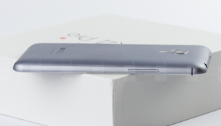
The Meizu MX4 Pro design is a display of craftsmanship with a solid build quality, thin bezels and nice in-hand feel.

A sibling to the recently released Meizu MX4, the MX4 Pro looks nearly identical in terms of design with an austere, yet stylish design. It’s noticeably taller than the MX4, but just a hair wider and thicker, so overall the difference between the two is minimal. The frame of the phone is made out of metal, but the back cover - despite its similar paint job and finish as that of the aluminum frame - is plastic. Still, the MX4 Pro is reassuringly well put together.

It’s worth pointing out that Meizu has done an outstanding job cramming in a large 5.5-inch display in a very compact-for-the-size body. The bezel around the screen sides has almost disappeared - it measures just 2.8mm, a remarkable engineering achievement. Admittedly, it is a hair wider than the almost unnoticeable 2.6mm bezel in the original MX4, but nonetheless impressive.

Just like on the iPhone, there is only a single physical home key where the fingerprint scanner resides on the MX4 Pro - no back button or any other traditional capacitive buttons. In order to go back in menus, you have the choice of either virtual, on-screen buttons, or an upwards gesture starting from that same physical home key.

With all the marvels of a thin bezel, though, Meizu has inconveniently decided to place the lock key in a hard to reach position on the top of the phone. Luckily, this is not really an issue on the MX4 Pro - the handset can also be easily locked by holding the much easier-to-reach home key. For those times you’d use the physical keys - the lock key on top and the volume rocker on the left - you’d appreciate the craftsmanship on display as they are both metal-made and clicky.


Display

The 5.5” Quad HD display is sharp and features vivid, but overblown colors that are not perfectly accurate.

The Meizu MX4 Pro comes with a 5.5-inch IPS LCD display with a 1536х2560-pixel resolution (Quad HD-ish). The interesting thing in Meizu’s latest phones - including the MX4 Pro - is the unusual 15:9 aspect ratio. When you hold the phone in a vertical, portrait position, this results in a wider-looking display, better fit for reading as lines of text do not appear as short and your eyes don’t have to jump between lines so often. Turn it over into horizontal, landscape orientation, though, and rather than have full-screen video, you’ll start seeing two very slim black stripes to compensate for the shorter, 16:9 common video aspect ratio.

In terms of sharpness, we’re dealing with a pixel density of 546ppi here, more than enough for even the most eagle-eyed viewers who examine their displays with a Sherlock Holmesian fever. The panel is also protected by Gorilla Glass 3.

What about the colors, though? At first sight, it’s obvious that images appear vibrant, with rich, juicy tones, but are they really accurate? Our analysis shows that the whites on the MX4 Pro are a bit on the cold, blue side with color temperature of around 7500K (above the reference 6500K value). RGB balance is off with overblown blues and greens, and underrepresented reds. Gamma is perfectly close to the reference 2.2 value at 2.15, so overall output is fairly well controlled throughout. Turning over to color and saturations, we see that while the MX4 Pro - admirably - sticks to the sRGB color gamut triangle, colors are purposefully blown out of proportion and look unnaturally saturated. We’ve seen way worse, but it would have been nice if the color balance was a bit better.

Brightness can be cranked up really high and while we’ve seen phones filter out reflections a bit better, the MX4 Pro is definitely one that is fairly easy to use outdoors, even under direct sunlight. It’s worth noting that the brightness can also be reduced to very low levels, which is neat for night birds who value a very low minimum brightness, key to avoiding irritating your eyes. Finally, viewing angles are also nice and wide.

Display measurements and quality

Wednesday, June 1, 2016

Zenfone 2

Zenfone 2 Review: Why Shouldn't You Buy This Fantastic Budget Phone?

Zenfone 2

For the past year, if you wanted a cheap-but-good smartphone, the internet would point you firmly in the direction of OnePlus and its too-good-to-be-true One smartphone. Now, it has some competition: the ZenFone 2 from Asus.


OnePlus One Review: An Unbelievably Fantastic Smartphone

Maybe you've heard of the OnePlus One. It's the self-styled "flagship killer"…


What Is It?

An unlocked 5.5-inch Android handset, which you can easily buy off-contract and use on any GSM network. (Think T-Mobile and AT&T, not Verizon or Sprint.) There are two versions: $200 gets you a 1.8GHz Intel processor and 2GB of RAM, while $300 sees that upgraded to 2.3GHz and 4GB of RAM. Either way, you’re looking at jaw-droopingly good specs for something that costs halfof the average flagship phone.
In other words, it’s a lot like the OnePlus One.

Who’s It For?

People who don’t want to be tied to a two-year contract. Klutzes who break phones halfway through contracts and need a replacement (hi, friends!). Anyone who looks at the attention-grabbing features of the flagship Android handsets and just goes ¯\_(ツ)_/¯.
The Zenfone has one other party trick: thanks to the dual SIM card slots (and the fact that it’s an unlocked phone you can use on any GSM carrier), it also makes a good travel companion: you can pick up a local SIM at your destination to use for data, but keep your American card in the second slot, and still pick up cell calls on your regular number.

Design

If the Zenfone’s internals are standard-issue Android, then so is the design: Gorilla Glass front, three (non-illuminated) buttons down below, and a curved plastic back hiding the dual SIM and microSD slots. Check, check and check.
But the Zenfone looks way classier than other phones its size—OnePlus One included. Apple and HTC would have you believe that a phone has to be handcrafted from aluminum by a British knight to be any good; the Zenfone’s understated, solid design makes a mockery of that. It’s a pleasant thing to hold that doesn’t feel like it will break when you inevitably drop it, and the plastic does a decent job of looking like brushed aluminum from a distance.

It’s not all roses and sunshine, though: the 5.5-inch phone is a little unwieldy. You know what makes that worse? Sticking the power button squarely in the middle, along the top. Sure, it probably pleases some designer’s aesthetic sensibilities (Clean lines! Symmetry!), but it sucks to use. Putting the button there means you’ll have to shift your grip every time you turn the phone on, or just suck it up and always use two hands. Frequently reply to texts while holding a coffee? Better get good at typing with your nose!
One cool optional addition is the $40 Asus ZenFone flip cover. It replaces the standard back cover with one that wraps all the way around the phone like a mini notebook, with a little window built into the front. When the case is closed, the screen behind that window has a couple of simple pages you can flip through, like time, notifications, weather, or a tragically awful camera viewfinder. It’s pretty cool.

Using It

The higher-end $300 version of the Zenfone has a 64-bit Intel Atom processor running at 2.3GHz, and 4GB of RAM. Does that mean it has a powerful PC-grade processor inside? Nah. In practice, it’s no better than the Qualcomm Snapdragons you’ll find inside most other Android phones.
But, importantly, it’s also not worse. The Atom processor in here powers through graphically intense games and 4K video streaming like a champ. It might not score quite as high as Qualcomm’s latest on the benchmarks, but where it actually matters, you’re not going to notice. Side-by-side with the OnePlus One and its Snapdragon 801, I challenge you to tell the difference: they both scream along just fine.
Ready for the catch? Asus has stuffed it to the gills with a ridiculous, insane, jaw-dropping amount of software bloat.
I know, it’s a little passe to complain about pre-installed software and Android skins. But trust me, things are bad:
Not shown: three further screens of bloatware-app shame
How bad? Well, on first boot, the Zenfone had 67 installed apps. If I spread them all out on homescreens (a thing you should not do if you value your soul or spare time), there’s four entire screens of pre-installed software on this pocket computer. Including apps that spam you with prompts to speed up your phone!
Okay, a few of the apps are admittedly useful, like Google’s suite of services; others, like the Asus™ Share Link and Asus™ Party Link and Asus™ PC Link, to be expected but still annoying; the handful of random third-party apps (hi, Omlet Chat) are just weird.
Things don’t stop at gratuitous apps, either. The Zen UI badly duct-taped onto Android Lollipop is flat-out ugly. It’s Google’s Material Design, but with none of the taste or the minimalism, just the garish colors. You can get rid of the worst part of Zen by installing your own app launcher, which basically replaces the home screen, but you’re always going to be stuck with the awful notifications and Settings.
Once you get past the software (alcohol helps), you might notice that Asus has hit almost all the key elements of a good phone head-on. The screen is 1080p, which in practice means a resolution good enough that you’re never going to see a single damn pixel. Where it counts, the screen is great, if not mind-blowing: colors are bright where the OnePlus is washed out. The only real let-down is the brightness — it’s a little dimmer than the average, which makes using the phone under direct sunlight occasionally frustrating.

The battery’s also surprisingly good. You’ll get a full day of use, if you abuse your phone with Bluetooth music streaming and turn-by-turn navigation; dial things back a little, and you can eke out two days of it buzzing your pocket.
On the $300 version, you get fast-charging technology that brings it up to 100% in an hour and half, but only using an Asus-provided charger. That’s good and bad: fast charging is a boon, but I guarantee you’ll end up charging your phone off a laptop or scrounged wall charger from time to time, and when you do, the 4+ hours it’ll take to charge will drive you slowly crazy.
The only major hardware disappointment is the camera. On paper, the 13MP sensor with a dual-tone flash should be fine, but some combination of poor optics and bad image processing makes the end result pretty dire. The actual process of taking photos is fine—the Asus camera interface is actually pretty good, and autofocus is fairly quick and accurate—but every image I’ve taken has been utterly destroyed by noise.
I mean, take a look at these two images:

Sample image and 100% crop, taken at f/2.0, ISO 50
I thought I took a gorgeous landscape pic (score one for early-morning climbing), but if you expand the photo, or god forbid look at the 100% crop, the noise will make you weep.
Lowering the ISO or changing lighting conditions doesn’t help, so I’m assuming it’s something to do with the software image processing. Either way, it doesn’t matter—the camera is fine for Snapchatting your dinner, but not much else.

Like

A phone that does all the phone things well. There’s nothing in the way of added extras like fingerprint sensors, waterproofing or curved screens; but at the core business of just being a smartphone, the Zenfone is pretty damn good.
I like the flip cover more than I was expecting. It provides a good way to check your phone when you’re around other people, while still showing that you’re just looking at the time, not completely ignoring the people around you in favor of Snapchat.


No Like

The power button is awkwardly placed, and will constantly remind you that five years ago, people would’ve considered the Zenfone 2 to be a tablet.
The camera is fine for basic Snapchat duty, but image quality doesn’t hold a flame to any flagship handsets. A phone for amateur photographers this is not.
The plastic window on the flip case gets really grimy real fast, since it lacks the oleophobic coating found on the glass of the screen itself. Not a huge deal, but keep a cleaning cloth handy.

Should You Buy It?

Probably not. Smaller flaws aside, the Zenfone is a real achievement. A $300 phone—heck, $200 if you don’t play hardcore mobile games—has no right to be this good. if I were buying an Android phone off-contract, I’d much rather have it and $300 in change, than a Galaxy S6.
But the Zenfone 2 doesn’t exist in a vacuum, and OnePlus has already pulled off the same trick of incredible value. The Zenfone is an all-round better device than the OnePlus (just!), but in about two weeks, that’s not going to matter so much: the next iteration, the OnePlus Two, is due out at the end of July.
Given that the Two will almost certainly be another mid-priced Android handset with top-end specs, it’s probably worth waiting to see what comes out, at the very least. The Zenfone 2 is a fantastic phone for the money, but OnePlus redefined how much phone you could expect for $300 with the One; I’m willing to be that the Two will do everything the Zenfone 2 does, but with a slightly better camera, and a refreshingly non-bloated version of Android.

Asus Zenfone 2 Specs

  • Network: Unlocked, GSM (T-Mobile and AT&T in the U.S.)
  • OS: Android 5.0 with Zen UI
  • CPU: 1.8Ghz/2.3GHz Intel Atom ($200/$300 respectively)
  • Screen: 5.5-inch 1920 x 1080 IPS display (403 PPI)
  • RAM: 2/4GB ($200/$300)
  • Storage: 64GB, microSD slot expansion up to 64GB
  • Camera: 13MP rear / 5MP front
  • Battery: 3000 mAh Li-Po
  • Dimensions: 6.00 x 3.04 x 0.43 in
  • Weight: 6.00 ounces
  • Price: $200 (1.8GHz/2GB RAM) or $300 (2.3GHz/4GB RAM)

OnePlus One

OnePlus One Review: An Unbelievably Fantastic Smartphone

OnePlus One

Maybe you've heard of the OnePlus One. It's the self-styled "flagship killer" aiming to swoop in from China and beat the Nexus 5 at its own affordability game. That's a tall order, but the OnePlus One fills it. It's so dirt cheap, and so incredible, that it's damn near unbelievable.

What Is It?

A high-quality, $300 dollar off-contract phone that runs Cyanogenmod—a modded version of Android that's popular with tinkerers—out of the box. A Nexus in everything but name. A 2.5 GHz Snapdragon 801-driven beast with a 5.5-inch, ~400 PPI screen, and a hunky 3100 mAh battery. Another phone called the "One." A $300 phone from a Shenzhen-based start-up that feels waaay too good to be a $300 phone from a start-up. A damn good deal.

Why Does It Matter?

For years, Google has dominated the low-cost, unlocked, off-contract flagship space with its Nexus line. After all, how are you supposed to offer $800 phones at $300 dollar prices other than to find a bajillion-dollar company to subsidize the hardware?
OnePlus apparently found a way (razor-thin margins no doubt) and the end result is a giant, high-quality device that not only offers borderline ludicrous bang for your buck, but does it without being tied up in Google. Yes, the OnePlus One still ships with Google apps like Gmail preloaded, but hardware buttons or a modified operating system are something you'd never see on a Nexus. The OnePlus One opens up sub-$400 flagships (i.e. cheap, awesome phones) to a world that's not completely designed by Google. It's a bit of a shake-up.

Design


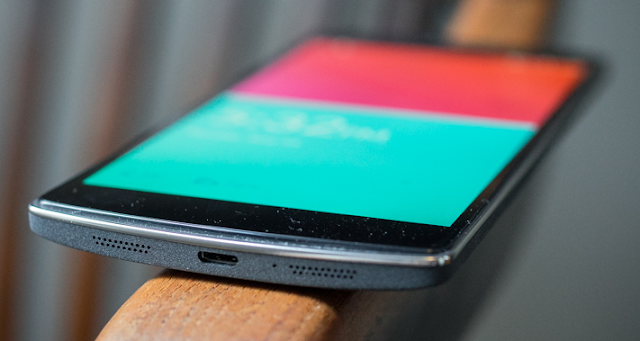
From the second you lay eyes/fingers on the OnePlus One, you can tell it's a high-quality device, almost impossibly so for the $300 price tag. It's got a solid sort of heft to it, and the screen is raised just slightly over the silver edges, which gives you a fun surface to run your fingers around when you're nervous. It also looks great.


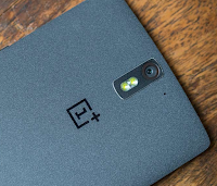
On the back, instead of opting for metal, your standard soft-touch plastic, or something glossy and cheap feeling, the OnePlus One we tested ("Sandstone Black") has a fabric-y sort of texture. It doesn't have any pull to it, and I'm inclined to think it's just a strangely rough sort of plastic, but it feels like the inside of a tablet cover, the part that sits against the screen when it's closed up. It's a unique and strange but not entirely unwelcome material. It feels like it'll get dirty quick—like you can't set it down for fear that it'll get greasy and stained—but after over a week of use it still looks great. It held up damn admirably to some time on my heinously unclean kitchen counter.
The style of the OnePlus One extends beyond just the phone though. This is the first gadget I've had in a long time where I've actually been impressed by the charging apparatus. That's right; its micro USB cable is badass. It honestly gives cloth-coated cables a run for their money, and it's completely untangleable.

The screen, a 1080 x 1920 pixel IPS LCD display, looks great in pretty much all scenarios. It doesn't have quite the contrast, deep blacks, or looks-good-outdoor-ness of an AMOLED display, but it is pretty. Definitely up to par with just about everything else out there.
And then at the bottom of the screen you've got your hardware buttons, long passé on flagship Android phones but a feature the OnePlus One seems content to keep. One each for "Settings," "Home," and "Back," in order from left to right. In other words, reversed from the order of software buttons that you're used to on Android, which takes some adjustment. Also the "Settings" button will default to bringing up an app's settings menu (questionably useful), though you can dig into Cyanogenmod's settings to turn it into a traditional multitasking button.
Fortunately all these buttons sit pretty compact at the bottom, and Cyanogenmod lets you turn them off all together in favor of on-screen buttons. But I still found myself wishing they weren't there.

Using It

Operating system
At the core of the OnePlus One-spericence is Cyanogenmod. For the uninitiated, this is essentially a forked, modified version of Android, kind of like Amazon's Fire OS except not nearly as drastic a departure. It's developed by the Cyanogenmod company rather than Google itself, and as such it lags behind Android updates just a little bit since Cyanogenmod's engineers have to do their own mods before it gets to your phone.
Don't let the name or the fact that it's not straight out of Mountain View fool you, though; Cyanogenmod is pretty damn faithful to the spirit of stock Android. The UI design is basically identical, but for a few immediately visible changes which a little added flair that basically amounts to "hexagons everywhere."

Cyanogenmod loves its hexagons.
Also unlike Fire OS, Cyanogenmod and the OnePlus One come with all the your favorite Google Apps installed by default. Future versions of the phone might not if Cyanogenmod ever loses Google's blessing, but the current version is close enough to stock Android that Google has agreed to let its essential default apps be included.
So what are the differences, then? It becomes clear once you dig into the settings, where you can start turning on some of Cyanogenmod's more useful features, most of which are just features that would be at home in Android but just aren't there yet.
Perhaps the most helpful is something called "Profiles." All profiles are option pre-sets you can create and save and trigger manually or set to trigger when you touch an NFC tag or connect to a given Wi-Fi network. So when I connect to my home Wi-Fi, for example, my "Home" profile can turn off my lock screen, jack up my notification sound, and disable GPS all automatically. It'snothing you can't hack together on your own in vanilla Android, but having it built in is great.
That's just a taste of the "Oh huh neat. Why isn't this in stock Android to begin with?" fun that Cyanogenmod has in store. There's an endless buffet of options, like app shortcuts on the lock screen, and customization that does everything from let you pick what tiles show up in the pull-down menu pan to changing the boot animation if you feel like it.

Performance
Of course it helps that the hardware underneath that custom OS just screams. The OnePlus One rocks a 2.5GHz Snapdragon 801—the fastest lil phone chip out there right now—and backs it up with 3GB of RAM. The result is a phone that almost never stutters, whether you're just zooming around the homescreen or playing some Hitman Go. I never ran into any performance issues except for a little freakout where Snapchat was freezing up, but I'm pretty sure that was Snapchat's fault.
With a serious engine under the hood, and that big beautiful display to run, battery life is a concern. Luckily the One's beefy 3100 mAh battery packs enough juice to get you through the day. I spent a big chunk of my time with the OnePlus One at my parent's place, and though I was getting up at 11 am every day (awwww yeaaaaah) I was putting the One through seriously heavy use. We're talking hours of reading Twitter on the couch, podcast listening, and general messing around while waiting for something to happen in a one-horse town. Multiple sustained sessions of 45 minutes-plus. And every day, the One still had a good 25 percent battery life when 2 or 3 AM rolled around. I could never have gotten away with that on my Nexus 5.

The only catch is that the One will really sip juice if you try to charge it with an underpowered charger. When I attached it to the same (random) charger that I use to charge my Nexus 5, I woke up to find that it had only gone from 10 percent to 75 percent in the 6 hours I had been sleeping. Though when you use the presumably more capable (and damn stylish) charger the One actually comes with, charge times are much more reasonable.
Camera
Okay, the OnePlus One's camera is not great, but it's not a total slouch either. The 13MP shooter performs pretty well in daylight, but less so in the dark of the night. I used it to capture unflattering pictures at my sister's high school graduation and the results hold up pretty well, but a lot of my shots came out blurry because the image stabilization is pretty meh, and the autofocus speed is relatively slow. It'll get the job done if you've got good lighting and you're not in a rush, but it's nothing to write home about.
I also gave the OnePlus One to my colleague Mario, who's a bit more qualified to suss out the finer points of smartphone camera-ry, and his takeaways were that the image stabilization was definitely pretty bad—even controlling for his own extra-shaky hands—and that the low-light performance was "a catastrophe" which I think this sample shot bears out pretty well.
Gawker HQ is a great place to work if you are an albino or a vampire.
All that said, this was using the stock Camera app. The results once you boot up the Cyanogenmod camera app (which honestly I managed to forget about almost entirely) get a fair bit better. The stabilization improves, and the low light performance is way less of a joke. It also helps that the Cyanogenmod camera has a fully customizable interface, so you can move the buttons around to the best on-screen position that will keep your fingers out of the way of the camera on the back. And you've got options like burst fire, and HDR in there as well.
Using the right app brings the One's camera a lot closer to par, but it's not a feature you'd want to lead with. For a $300 phone, though, it's hard to complain. And it's still better than the Nexus 5 if not by a whole lot.

Like

Cyanogenmod out of the box is great. Its changes are non-intrusive enough that the OnePlus One can and does feel like a stock Android device. If you have any familiarity with Android, you won't get lost in Cyanogenmod the same way that you might in proprietary skins. And because Cyanogenmod isn't just a skin but instead an operating system, it offers superpowers that go pretty deep.
Being able to pick and choose between using hardware navigation buttons or software navigation buttons is nice, and touch gestures that work even when the screen is off are pretty neat when they aren't misfiring. These are the kinds of Android tweaks that you would normally have to fall down a hole of rooting and flashing for, but with the OnePlus One, there's no barrier to entry.
The One is beautiful. Its subtle curves and textured back really make it a pleasure to hold. It's the kind of hardware that makes people say "oooOOOooo what is this?" in a good way. It's hard to make a rectangular slab feel unique, but the way the screen is set above the metal rim is both cool and subtle. It's an all-around good looking piece of tech.
It starts at $300, and just $350 for a 64GB model. I mean, what? That is nuts, and it makes up for pretty much any minor quibble you could possibly have with this thing.

No Like

Speaking of minor quibbles, there are a few to have. While Cyanogenmod is relatively unintrusive, some of its extra features that are on by default do not work well and are a drag. I can't even count the number of times my One's flash turned on in my pocket because it thought my leg was drawing a "V" on the screen, the gesture that enables torch mode. But you can just turn that off.
Built-in physical navigation buttons feel and look silly. Fortunately they're small and well-placed in the bezel, so if you decide to turn them off through Cyanogenmod and opt for the (far superior) on-screen solution, they don't feel like they're eating up too much space.

The camera is not great. It is not totally unusable or anything, but if "a good camera" is anywhere on the top half of things you are looking for in a phone, you are probably going to be disappointed. Ditto the speakers. It's at this point though that I have to reiterate: Three. Hundred. Dollars.
The OnePlus One a little big. There's nothing wrong with a big phone if you are into that, but the it fails my one test of ergonomics: I can't easily swipe down the notification bar with my thumb while supporting the phone's weight with my pinky, and I have biggish hands and longish fingers (according to every music teacher I've ever had, anyway). It'd be nice if there was a smaller option. Something closer to 5 inches.
All the extra features of Cyanogenmod—like customizable profiles and theming options that let you do everything up to changing the boot animation—are great, but running an alternate OS is a speed bump to getting new features from Google. When the new L release comes out, you'll have to wait for it to make its way into Cyanogenmod, which will probably take a few months. While the OnePlus One feels like a Nexus in price and usability, it won't get quick OS updates like one.

Should You Buy It?

Yes! In a heartbeat! If you can. The big catch with the OnePlus One is that you need an invite before you can shell out for one, and demand is far outstripping supply. So if you want to buy one of these you'll need to know somebody, or luck into an invite by chance.
And before you ask: No, I do not have any invites.
It's $300 for a 16GB version, but more astonishingly just $50 more to upgrade to the 64GB. It's a steal. I think I'll be happy to move back to my slightly smaller Nexus 5, but if you can get your hands on an invite, the OnePlus One is a completely viable alternative to a Nexus, both in experience and in price. That's a pretty huge accomplishment.
Is the OnePlus One the flagship killer it claims to be? It certainly could be, but only if it finds a way to show up in force. For now it's an awesome oddity that will take some connections and/or dumb luck to get your hands on. But if you get the chance, take it.

OnePlus One Specs

  • Network: Unlocked, GSM (T-Mobile and ATT in the U.S.)
  • OS: CyanogenMod 11S
  • CPU: 2.5 GHz quad-core Snapdragon 801
  • Screen: 5.5-inch 1920x1080 IPS-LCD display (401 PPI)
  • RAM: 3GB
  • Storage: 16GB or 64GB
  • Camera: 13MP rear / 5MP front
  • Battery: 3100 mAh Li-Po
  • Dimensions: 6.02 x 2.99 x 0.35 in
  • Weight: 5.71 ounces
  • Price: $300 (16GB) or $350 (64GB)